Primary colours
Our primary colours are the backbone of the Sendible brand.
They appear most frequently across interfaces, communications, and brand expressions.
Periwinkle purple
#625AFA
Black
#1C1C1C
Off white
#FAFAFA

Colour is the most visible way our brand comes to life.
Our core palette expresses vibrancy, clarity, and adaptability across every Sendible touchpoint — from product UI to marketing campaigns.
Our primary colours are the backbone of the Sendible brand.
They appear most frequently across interfaces, communications, and brand expressions.
Periwinkle purple
#625AFA
Black
#1C1C1C
Off white
#FAFAFA
Our secondary palette adds flexibility and emotional tone to the brand. These colours act as supportive accents to the primary palette and help us adapt to different needs across platforms and media.
They are used differently depending on the platform and context — for example, a specific subset of this palette is used for the website, while another subset might be more prominent in marketing materials.
#FFE9E5
#FFD0C6
#FFB7A8
#690D00
#CFF5F6
#A2E5EF
#75D5E8
#003262
#D7F7C2
#A6EB84
#76DF47
#00373F
#FFE7F2
#FFCCDF
#FFB1CD
#68052B
#FCEDB9
#FCD579
#FCBD3A
#5F1A05
#F2EBFF
#DFD3FC
#D1BEFE
#302476
Our secondary palette adds flexibility and emotional tone to the brand. These colours act as supportive accents to the primary palette and help us adapt to different needs across platforms and media.
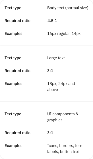
Colour isn’t just aesthetic — it’s functional. To ensure our designs are inclusive and legible, all text and interface elements must meet WCAG contrast ratio guidelines:
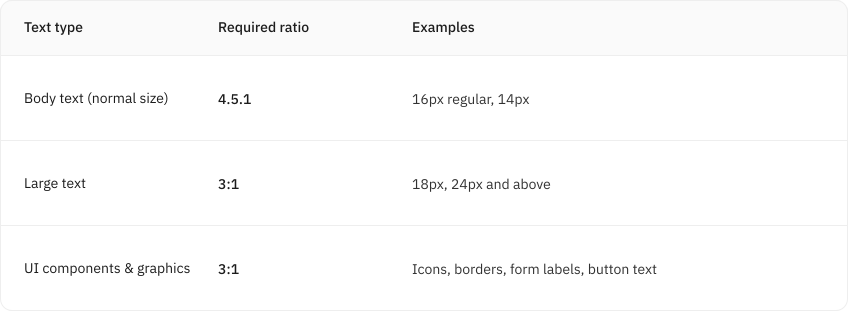
Note: Ratios compare foreground (text) to background colours.
Our selected colour pairings have been tested and meet accessibility standards. If you stick to the approved combinations, there’s no need to recheck contrast.
However, if you introduce custom combinations or layer text over gradients, imagery, or non-standard colours, please use tools like the Ally Contrast Checker or Figma plugins (Able, Contrast) for real-time accessibility validation.